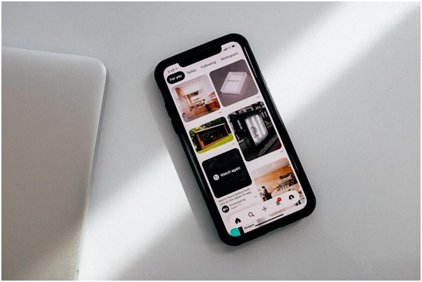
The best way to show off a product is to have no empty room on the mobile mock-up. Instead, show off a product by demonstrating how it works for the people it was made for. Mockups are a special tool that web designers use for this. What mock-up options are available at your disposal, and how to make use of them? We will try to answer these questions further in this post.
Why You Need a Mock-up
Your target audience needs to know what a product will look like and how it can be used. And this is something that a mock-up can do for you. There are multiple options to choose from at https://www.ls.graphics/mockups/phone-mockup if you are looking for a mock-up. Realistic mock-ups, schematic mock-ups, flat mock-ups – these are some of the design options.

Regardless of the solution you decide to go for, it is better not to use real photos of the app’s interface to show what the product is like in the shop. Modern ASO needs images to be able to talk to people and earn their trust. This is why:
- Show how the app will look when you use it.
- Explain how people can use the solution.
- Showcase unique features of the product.
Because of this, designers and ASO experts need to know how to create highly converting mock-ups.
Different Mock-up Types and How to Pick the Right One
The first thing that needs to be done to make a mock-up is to choose an operating system. This is because the app shop that the image is being made for will decide which device to use.
You should use an iPhone or iPad if it’s the Apple App Store. If it’s Google Play, get an Android phone from Samsung or another brand. You should change the images for each type of gadget (like laptops or smartwatches) if the product is also meant for those.
When putting an image inside the sketch, you should think about the following things:
- The ways that Android and iOS gadgets work are different. At the top, next to the camera, there are different buttons that show time, font, battery life, internet, the presence of a screen or island, and camera type. In iOS, users can also swipe up or down from the bottom to switch between apps.
- The sketch should be made with the newest versions of the gadget. If you’re advertising an app in 2024 with an iPhone 15, for example, it wouldn’t make sense to use screenshots of it on an iPhone 8.
Mockups can also be put into groups based on how they look. Here are some of the design approaches to follow.
Realistic 3D Mockup
In this mock-up type, the gadget is featured looking as much like the real item as possible. It gives you a complicated design and lets you see clearly how the app will look on a smartphone.
As research results show, people like realistic mockups the most, but keep in mind that they can make the design look less attractive. This is especially true if the backgrounds of the screenshots are dark or employ patterns, or if the app’s UI is too full of information.
Another problem with realistic 3D models is that they are hard to change because they are so complicatedly made. For instance, it will be hard to change the color after the sketch is finished.
Schematic 3D Mockup
A spherical sample of the real gadget is used in this mock-up type. It’s more artistic than the first option and only shows a sketch of the smartphone. For bright, fun designs, a basic 3D model works better. As an example, messaging, online shops, game platforms, and other mobile goods that have the right brand style can be used.
Flat Mockup
A flat mock-up has the look of a two-dimensional drawing of a device. The vector style makes this design very flexible because you can quickly change the colors, lines, or transparency. No matter how creative you are or what the application needs, you can style flat models in any way you like.
Make the Right Choice!
The way an app looks in the App Store and Google Play is very important to the company’s success, and a mock-up is a big part of this. It lets you show what the app will look like when it’s being used. This is a great way to stand out from the other apps because it shows the app in a creative way.

